
Under Dogs
I made a cover I did for a childhood friend and his upcoming series about a couple of ex-military crime-fighters, called Under Dogs. He plans on publishing them first as a written series, hoping to move it to a comic book format. More details to follow, as they develop.


Sketch
Nothing really new to report, I'm just trying to do some more "finished" art, and by that I mean, at least colored. So...new thing that I did with color on it. wheee!

An End to the Means Process
I just finished a commission for a local indie jazz musician, Andy Mowatt. He's releasing his new album An End to the Means, so he needed a cover for his cd and vinyl release. He asked for something in the vein of Runaways, something post-apocalyptic with a similar atmosphere and color scheme. He wanted an image to really show the idea "An end to the means," or in other words, a new beginning from a disastrous end. Most of these show life growing up out of the rubble.


 As you can see, it's very rough and its only purpose is to get the general idea of what I'm trying to do. After I finished this rough, I printed it out to full size, 14 x 14 (larger than life, so the detail will shrink down a little tighter than I drew it.) I had to print out the 4 different corners and taped them together to get the full size. I coated the back of the picture in graphic with a pencil, and transferred the image onto the cold press Bristol board. I then used the graphite transfer as guidelines and drew over it with a blue col-erase pencil.
I inked over the lines with my #3 sable brush and black Winsor & Newton india ink. I used the drybrush technique (blotting the first couple of strokes off the brush after dipping it, so the line becomes broken and textured), in an attempt to somewhat imitate the style of Craig Thompson. I then scanned it (again, in 4 parts, due to my smaller scanner) and pieced it back together in photoshop.
 I cleaned up the lines before I started painting, but this is just the raw scan of the inks. You can still see some of the blue lines. Those will be taken out by using the Black and White adjustment and sliding the cyan setting so that it matches the white of the page.
The hardest part being done (some would say), I painted it in photoshop. I made the inks in the jungle area deep purple for a little warmth, and the rest, a dusty brown, so I could fade the background out, making it disappear into the distance, with a thick layer of dust filling the sky and making everything hazy.


^ He decided he liked this one.
The reasoning behind this one was to show this wasteland, a radioactive-yellow sky, and the smoking ruins of a once thriving city. In the foreground, the catalyst for the apocalypse is planted like a seed, a massive, lush forest growing up around it, teeming with life.
From there, I scanned it in at 600 dpi (dots per inch) and painted over it in photoshop. I first did a rough painting over it it in greyscale, to get the composition, values and the depth of field to where I wanted it. In order to accent the subject, I decided that the darkest part should be the forest, and the lightest part, the meteor.
I then added the color to the rough values, trying to keep the color scheme succinct and unified.
I inked over the lines with my #3 sable brush and black Winsor & Newton india ink. I used the drybrush technique (blotting the first couple of strokes off the brush after dipping it, so the line becomes broken and textured), in an attempt to somewhat imitate the style of Craig Thompson. I then scanned it (again, in 4 parts, due to my smaller scanner) and pieced it back together in photoshop.
The hardest part being done (some would say), I painted it in photoshop. I made the inks in the jungle area deep purple for a little warmth, and the rest, a dusty brown, so I could fade the background out, making it disappear into the distance, with a thick layer of dust filling the sky and making everything hazy.
The outline was simply to keep the dimensions all intact. This was a halfway point of being finished, the background being in severe need of cleanup, though the foreground was, for the most part, finished.
This is the final (until further notice), with a slightly brightened up jungle and a mellowed out and tightened up background. I ultimately decided to paint over the lines on the background, since it hurt the atmosphere more than it helped it. The typeface is the same color as the jungle lines, so that it ties it all together.
I hope you dig it! Contact me if you want something done for you or spread the word to anyone who is looking for an artist! (that didn't come off as desperate, did it?) Stay tuned for some more art things!
Mural
Hey guys!
I haven't had a whole lot going on in the past month, but one thing of note is that I was asked to paint a mural for a local youth center. Teen Central, the youth center, is a non-profit business, so I gladly did it pro bono.
After a bit of discussion about the content of the *mural, the director and I decided on a pretty straight-forward design that featured a couple youths.
I drew the design in photoshop.
 I had a friend print it out on a transparency sheet and we went out in the middle of the night and I traced the line art with a sharpie on the cinderblock wall.
 I then realized I should have prepped the surface, after doing some research, so I did that around the lines. That included sanding and washing the wall so it would take the paint better.
I bought cans of All-Weather acrylic paint, one of every primary color. I started on the flesh tone on the boy first. I decided to paint it cell-shading style, since blending would be nearly impossible with the materials I had. I had the base (caucasian) flesh tone and created a highlight and shadow tone from that.

 The wall is east-facing, so the sun is shining directly onto it. When I first put the flesh tone on, it looked fine, but when I removed my sunglasses looked like the color of the wall, and I was practically blinded by the reflected light. Luckily, the paint dried much darker, and it all worked out! It wasn't necessary for you to know this, but I thought it was a fun tidbit.

I had to repaint her flesh tone a couple times because it kept on drying waaay too dark. I was able to save it using two or three highlight tones and two or three shadow tones.


I haven't had a whole lot going on in the past month, but one thing of note is that I was asked to paint a mural for a local youth center. Teen Central, the youth center, is a non-profit business, so I gladly did it pro bono.
After a bit of discussion about the content of the *mural, the director and I decided on a pretty straight-forward design that featured a couple youths.
I drew the design in photoshop.


I bought cans of All-Weather acrylic paint, one of every primary color. I started on the flesh tone on the boy first. I decided to paint it cell-shading style, since blending would be nearly impossible with the materials I had. I had the base (caucasian) flesh tone and created a highlight and shadow tone from that.


I started the lettering a few weeks later, due to conflicting scheduling. I had an idea of what I wanted the lettering to look like, but I ended up free-handing it on the wall. I measured it out using the bricks. That was really time consuming.


I got my finger in the edge of this one :( You can see the edge where the rest of the wall was repainted. I had a bucket of the paint they used for that, to go around the edges and use it as an eraser
where need be.
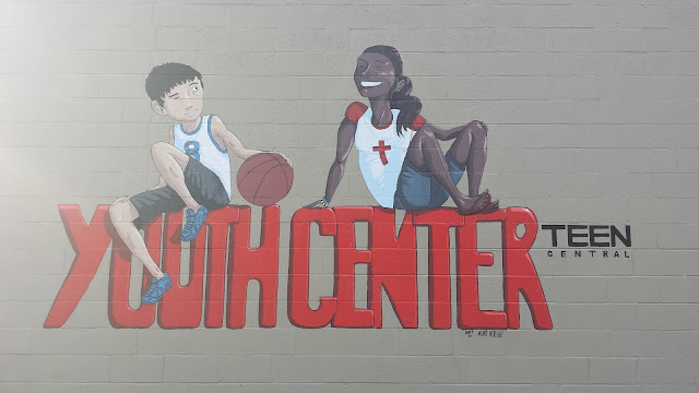

This is final painting. I didn't get any photos between these two, but I added highlights and shadows to the lettering, and filled the wall color in, and I painted the lines in black paint.
So that's it, sports fan, I hope you like it! You can see it person if you happen to live in the area. It's on Wolf Street in Manheim, PA.
If you have any questions, feel free to leave a comment or email me. I'm available for commissions, contact me for details
If you have any questions, feel free to leave a comment or email me. I'm available for commissions, contact me for details
Some of my best friends are animals
Hey, I'm still here! I finally did a thing worthy of putting up on my blog, kind of. My friends and I at Drunk Lightning drew each other as animals!
I drew my great friend Nicky as a bat!


I drew my great friend Nicky as a bat!


This is her! and for side-by-side comparison, is her real life form! Also, me! Also, note the red pants. It's a thing.
Go forth and check out her stuff as well!
Also, the Drunk Lightning blog which will soon have all these animal people up! (still waiting on a few submissions)
Thesis project
Thank you to all who made it out to the show on friday! It was a smashing success; over 2000 people came through the senior show, which is a new record high! I'm sure the fact that it was First Friday and Art Walk didn't hurt, but I appreciate all who stopped by. For everyone else who didn't get to make it out to the show, I'll fill you in on my bit. As I had posted earlier on in the year, my thesis project was to write and draw a graphic novel.
I had four parts illustrated for my thesis, just excerpts to show the story. The graphic novel will be , for the most part, wordless.


 So everyone who missed the show is now caught up with everything. I plan to keep this going in the background and plan to publish once I finish. Stay tuned for updates.
This is a historical fiction about a young Japanese man during the start of World War II. He had a defect from birth, a crippled leg. His father was a high ranking general in the Japanese military. When World War II broke out, the young man was unable to enlist due to his condition, and brought great shame and disappointment to his family. He had to stay home with the women and children when all of his male relatives and friends went off to war. He soon learns that his father was killed in combat, and at the funeral, he decides he needs to do something. He decides that the only way he could do anything of value and to win back honor for his family is to enlist as a kamikaze pilot. Considering himself a failure his entire life, he could at least die with purpose and make his existence worthwhile. The moment of truth finally comes, and he's over some south pacific islands in his plane and his target is chosen. As he swoops down, he is shot out of the sky. The plane veers off target and he crashes into the water. His body is washed ashore on one of the islands and he opens his eyes. He has failed once again. Not only did he miss his target, but he didn't even die. But as he lies there in the shallows, a new thought comes to his mind. He's dead. As far as anyone knows, anyways. He's the only one who knows of his survival. His mother, his wife, his government and platoon all think he's dead. This can be a new beginning for him. He no longer has to live with the disappointment and shame he's caused his family. He sits up in the water, the will to live flooding back into his body. A strange feeling, having embraced the idea of death for so long. He's been reborn.This is the 1st part of a planned four part graphic novel. The rest follow his escapades as he encounters some dangers and trials, and he looks for a way of escape.
I had four parts illustrated for my thesis, just excerpts to show the story. The graphic novel will be , for the most part, wordless.


The Pig Devil made me do it
I am still alive, you guys! Sorry for the long radio silence, school is crazy right now. I actually have a bunch of other stuff I can post up from other classes, but I'll probably end up just posting them all after school is done (which is in like, a month!)
Anyways, we were given an assignment in Subversive Illustration, and that was to do an illustration for a short story. The story, in summation, is about a man with an intestinal disease getting his digestive system replaced with a pig's. It works perfectly, but effects his appetite. He now eats garbage and pretty much anything he can get his hands on. The government sees an opportunity in this and starts doing this procedure on homeless people, hoping to take care of hunger and garbage problems at the same time. They started eating other people, and the government locked them up until they eventually ate each other until there was only one man left. He ate his own limbs and then died.
tl;dr: A man gets pigs guts and ends up eating people.
Process!

 I threw some color on top of the sketch. I had decided pretty early on that I wanted to attempt this one in gouache (it's kind of like watercolor paint, but thicker and more opaque). I wanted to get a good idea of what colors I wanted before diving in with the paint. You always need a plan!


Anyways, we were given an assignment in Subversive Illustration, and that was to do an illustration for a short story. The story, in summation, is about a man with an intestinal disease getting his digestive system replaced with a pig's. It works perfectly, but effects his appetite. He now eats garbage and pretty much anything he can get his hands on. The government sees an opportunity in this and starts doing this procedure on homeless people, hoping to take care of hunger and garbage problems at the same time. They started eating other people, and the government locked them up until they eventually ate each other until there was only one man left. He ate his own limbs and then died.
tl;dr: A man gets pigs guts and ends up eating people.
Process!

small thumbnail sketch. I did five or six of these, and I landed on this one. This is scanned directly in from my sketchbook. The red pencil is Prismacolor Col-erase pencils. I always use these as a rough first layer, and then a tighter graphite drawing over top. It's a lot easier to tell these layers apart and have revolutionized my drawings!


This is the scan of the gouache painting. I drew this freehand, based off of another sketch I did (I didn't scan that one, and I'm too lazy to do it now. It looks closer to the final painting than the first sketch did)

Naturally, I screwed something up painting it, so I did some editing to the color in photoshop, moved some stuff around a tad, etc. There's always something that needs doing.

And here it is as it would appear in a magazine had it been published! Hooray!
That's it for now. Feel free to message me or ask me questions or whatever. Thanks for stopping by and checking it out!
Sketchdump
It's been a while since I've posted anything, but I have been busy doing stuff, just nothing that got finished or has a deadline yet. Sooooo... sketchdump


Fear not, I shall be posting more stuff and soon, it's just not all done yet
Monkeys in Space!
Today in class, we were given a rush job assignment (to keep up with the news, I'm sure) about the Iranian monkey space program. Given from 10 am to 1 pm when we get out of class, we had to have the project done. Just a fun little project simulating a real life situation that could actually occur as a freelancer.


A bit sloppy, but hey, it's a rush job, what do you want from me?
Thesies Piecies
I'm going to periodically be putting up progress from my Thesis. I said I was going to keep it hidden from you, but you know what? I love you guys! I could never turn you away. I mean, look at those puppy dog eyes!
So! Here is the first reveal: I'm working on a story that is eventually going to be a graphic novel!


So this is Takeru, my main character. I'll be posting more things about this as I develop it, but I'm super excited about this, you guys!
So! Here is the first reveal: I'm working on a story that is eventually going to be a graphic novel!


So this is Takeru, my main character. I'll be posting more things about this as I develop it, but I'm super excited about this, you guys!
Tattoo part II
So I know I just posted the sketches, but I finished the tattoo yesterday, so I guess there's no point in keeping you waiting!
 There was a slight change of plans, and instead of inking and then digital painting, I painted it completely in gouache. I never really used gouache before, but it's a ton of fun! I even did the lines in gouache. Then I cleaned it up in photoshop.
So the idea behind this is the vastness of the universe and how little we actually know about it. The monsters themselves don't really represent anything specific, except the newt thing, which represents the parallel between space and deep sea, both of which are barely explored. I was inspired by one of my favorite quotes by H.P. Lovecraft-
"The most merciful thing in the world, I think, is the inability of the human mind to correlate all its contents. We live on a placid island of ignorance in the midst of black seas of infinity, and it was not meant that we should voyage far. The sciences, each straining in its own direction, have hitherto harmed us little; but some day the piecing together of dissociated knowledge will open up such terrifying vistas of reality, and of our frightful position therein, that we shall either go mad from the revelation or flee from the light into the peace and safety of a new dark age."
Side note: Does anyone else get reminded of Calvin and Hobbes when looking at the skeleton? I can't look at it without thinking that..

So the idea behind this is the vastness of the universe and how little we actually know about it. The monsters themselves don't really represent anything specific, except the newt thing, which represents the parallel between space and deep sea, both of which are barely explored. I was inspired by one of my favorite quotes by H.P. Lovecraft-
"The most merciful thing in the world, I think, is the inability of the human mind to correlate all its contents. We live on a placid island of ignorance in the midst of black seas of infinity, and it was not meant that we should voyage far. The sciences, each straining in its own direction, have hitherto harmed us little; but some day the piecing together of dissociated knowledge will open up such terrifying vistas of reality, and of our frightful position therein, that we shall either go mad from the revelation or flee from the light into the peace and safety of a new dark age."
Side note: Does anyone else get reminded of Calvin and Hobbes when looking at the skeleton? I can't look at it without thinking that..
Tattoo
Attention, everyone!
Rumors of my demise have been greatly exaggerated, and I'm actually totally fine. I was pretty busy over break, and unable to make any new post. I'm starting a new semester at school, and I have many new projects coming, so worry not.
Meanwhile, I'll post some sketches for some current projects!
 So this was the original sketch (ok, I actually had a really crappy doodle that this was based on, but I don't happen to have that scanned, so you're not allowed to see that. Also, it was pretty crappy and bad.) That's the earth floating there in the middle. (The squid/cuddlefish thing was going to substitute for the fish, but I decided to not go with either.)
 So instead of the fish or the cuddlefish, I went with this little cosmic newt. The original reason I was subbing out the fish was because he was too cute, but you know what? I like cute! So the newt is staying. My next phase is printing out, tracing (on my new light table I got for Christmas!) inking it, and scanning it back into the computer. So the next time you see it, it will be inked up and ready for some color! It needs to be finished by Wednesday, so I'll have it up around then. Keep an eye out, I'll be back soon!
Oh, also: I have an exciting new project I'm working on for my thesis! I'm not going to show any of it until all of it is done, but I'll show some teasers for it. So keep an eye out for those too!
Rumors of my demise have been greatly exaggerated, and I'm actually totally fine. I was pretty busy over break, and unable to make any new post. I'm starting a new semester at school, and I have many new projects coming, so worry not.
Meanwhile, I'll post some sketches for some current projects!


Oh, also: I have an exciting new project I'm working on for my thesis! I'm not going to show any of it until all of it is done, but I'll show some teasers for it. So keep an eye out for those too!
Runaways!
My piece is done! I don't really have a whole lot to say about this, so here it is!
 I actually was given a few things to fix, so by the time I submit it into the Society of Illustrators student contest (that what this was for, I don't think I mentioned that) but I'll have them fixed by then. Anyways, let me know what you think!

Under the boardwalk...
Hey, all. Since my final 'Runaways' piece isn't quite done yet, I thought I'd offer up a bit of a teaser until I get the piece finished later on this week. That, and I'm putting off doing an assignment, and this is a semi-productive way to do that.
 This is my semi-completed piece/ fully completed line art. This is all traditionally ink using the dry brush technique. Under the pier currently looks pretty light for being in a shadow, but I just knew I'd screw it up if I tried to shade it using ink, so I'm taking the safe route instead, and doing that all when I color it in photoshop. Anyways, thanks for checking it out, and I'll have the final piece up sometime this week (the assignment is due on Thursday)

Sketchdump
Hey everybody!
My apologies on how long this project is taking, but if it's any consolation, I'm super excited to see how my inks are turning out! I even took a progress photo with my phone, but it decided to have an error while saving, so I am sadly unable to show you.
So instead, here are a few drawings for you guys!


My apologies on how long this project is taking, but if it's any consolation, I'm super excited to see how my inks are turning out! I even took a progress photo with my phone, but it decided to have an error while saving, so I am sadly unable to show you.
So instead, here are a few drawings for you guys!


Sugar Rush Bandwagon!
Thanksgiving break was amazing! Because I was busy doing important things, I didn't do a whole lot of art things, BUT one thing I did do was go see Wreck-It-Ralph, and it was so good! Anyways, because this is apparently a thing now, I thought I'd go ahead and jump on this bandwagon and turn myself into a Sugar Rush character!
 My last name being Hershey, I of course had to theme it as Hershey chocolate, more specifically, the Hershey Kiss. I don't really have any idea for what my name would be, so if you have any ideas, let me know!

Nike ads
Here are a few older pieces I thought I'd share with you guys.
These were part of the project to advertise the same Nike product throughout the entire semester.
I chose to do Women's snowboarding boots. There were a couple reasons for this, mostly because I find that women snowboarders would be a fun target audience. I like the mindset of snowboarders; they're carefree and adventurous, risk takers.


 This was a billboard ad design. Just another drawing of nonsensical (robot) violence. From what I know about snowboarders, they like this sort of thing. Source: I'm a snowboarder, and I like this sort of thing. I'm pretty sure it's universal.
These were part of the project to advertise the same Nike product throughout the entire semester.
I chose to do Women's snowboarding boots. There were a couple reasons for this, mostly because I find that women snowboarders would be a fun target audience. I like the mindset of snowboarders; they're carefree and adventurous, risk takers.

This was for a magazine ad. I wanted to get a really big, fun feeling
for this campaign, so it's basically evil robots that apparently have
reasons to hate our heroine here. But, thanks to these rad new boots,
she should have no problem kicking mechanical tail.

My friend, Liz, was kind enough to pose for me. (Also, you can check her awesome art out at her website, lizcleavesillustration.com!

After scanning in the drawing, I painted over it in Photoshop.
I used the same process for the next one.

Process Post: Under the Pier
For our current project in our Studio class, our assignment is to create a piece specifically to enter into the Society of Illustrators student contest. There were no specific rules or guidelines as to what we were supposed to make. The only thing they told us to do was to make it represent ourselves as artists; this should be able to be put on the front page of home pages and forever tell the world what we stand for. No pressure or anything.
What I've finally settled on is a couple of runaway teenagers. I'm only a few steps into the process, but I shall post what I have so far. I'll continue to post as I get farther along in the process.


 These are a few thumbnails I drew before settling on what I ended up choosing. The bottom-right was the last thumbnail I drew before getting to the one I chose. You can pretty easily see how it morphed into the one I picked.


What I've finally settled on is a couple of runaway teenagers. I'm only a few steps into the process, but I shall post what I have so far. I'll continue to post as I get farther along in the process.


After throwing the idea around for a while, and sketching out different variations, I finally came to this one. It happened mostly by accident. I added the top diagonal just for the purpose of composition, and it quickly turned into this.

I scanned it, put it in photoshop and fixed stuff. I changed the paper size to open up the composition. In the thumbnail, the pole was right on the edge, and that's generally a big no-no. Also, the background pier went straight through the male character's head and leg, and that's also something you don't do. That would be a tangent, and we don't tolerate those in these here parts. (I realize the pier is still pretty confusing with his leg. Fear not, I shall be fixing that)
As far as the lighting and color go, the thumbnail looks a bit too much like a sunset. I want to have light coming through the boards, causing sweet lines to fall on my characters, so I need the sun to be in the middle of the sky, noon style. Also, then I can have pretty vivid colors, and make it feel all warm and summery. It's gonna be pretty much two-toned, with variations of yellow for the sky and blue/teal for the shade.
I want a strong emphasis on mood in this piece. I'm trying to evoke the feeling of summer as a teenager. There's that sense of freedom you get from the lack or responsibility, and yet there's the feeling or imprisonment, because as a teenager, you have no way of changing your situation, and can only run from them. I want it to feel a bit like Peter Pan's lost boys, never wanting to grow up, yet simultaneously be grown up immediately.
Anyways, keep an eye out, updates are coming soon! Also, some other stuff that has nothing to do with this project will also be coming! Lucky you!
Subscribe to:
Posts (Atom)